|
"How I Feel"
|
Inspiration & Research


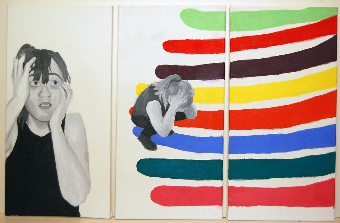
The first panel of this triptych is largely inspired by the look of this particular Cindy Sherman photograph. For one, they're obviously both black and white, and it's used to create the strong differences in shade and make a piece with a dramatic feel. There is also influence in the way I framed the image in the first panel. The angle in Sherman's photograph is unusual, slightly shot from below, with a framing that comes with it that implies that the woman has walked into the shot and hasn't been posed for it. Similarly, the figure in the first panel of my piece is framed strangely, with an arm extending off canvas and eyes looking at something unknown off in the distance in the same way Sherman's does. However, my piece doesn't take any inspiration from her "Stills" series thematically.
The colored sections of my piece are directly inspired by the piece "Where" by Morris Louis, among other color field pieces by the same artist. I especially like this one because all of the colors are unusual shades of the colors used, which I also made an effort to do. His piece also has a bit of a feeling of movement from bottom to top, and I took that same goal, just from right to left. I feel like his pieces like this look like a visual representation of some sort of happy emotion, which I wanted to incorporate into my piece, moving into a happy feeling.
The colored sections of my piece are directly inspired by the piece "Where" by Morris Louis, among other color field pieces by the same artist. I especially like this one because all of the colors are unusual shades of the colors used, which I also made an effort to do. His piece also has a bit of a feeling of movement from bottom to top, and I took that same goal, just from right to left. I feel like his pieces like this look like a visual representation of some sort of happy emotion, which I wanted to incorporate into my piece, moving into a happy feeling.
Planning


|
This planning sketch was the first that I made for this piece, and I liked it immediately after completing it. The sketch was put together strategically, measured out to have the same ratio of width to height as the canvases would have. I put a lot of detail into the first sketch, more than I maybe needed to, but it's definitely why I didn't feel the need to explore other concepts.
This sketch is more like a mock-up than a sketch. It's generally the same as the first, with specific measurements to create the same ratios again. This mock-up was drawn on bristol paper to work well with my alcohol markers, instead of using sketch paper that would allow it to bleed and blur. Drawing this was extremely helpful in the painting process, being able to look at the way the color would interact and how far it should bleed into the other canvas. This set of sketches was made to experiment with different ways that I could use the "mouth forced shut" motif I was going for. I tried specifically for the look of melting lips or mouth in the top right, but it didn't work out. In fact, none of these sketches worked out for the final piece. I dropped the taped mouth idea, the hands over mouth was a bad idea, and just having a shut mouth didn't really express the emotions I needed to be in the piece. |
Process


|
Above are the images I used as reference for my piece and planning sketches. I used the first image by projecting it on to my canvas and tracing out a cartoon. I also used it as reference for where what shadows fall where. The second image was used for making my planning sketch, as a pose reference for what I generally wanted to do. The last picture I used both as a reference for my planning sketch, which I then projected onto my canvas.
First I built my canvases and covered them with two layers of gesso. Then, I projected the images onto the canvases, and traced a cartoon of the image. I only did this for the first two canvases, because I decided to do the color streaks as I felt fit. |

|

|
Painting
|
|
For the first panel, my goal was to create an uncertain and scared expression. When I started this canvas, I started with the arms because they're large and round, with simpler shading, it's a perfect way to start. Throughout the whole painting, I experimented with blocking in color and blending, versus putting down the lightest shade and building up to the darkest. The arms specifically were the former, and the face was the latter. The facial features were relatively simple except for the eyes. I had some trouble creating the look that I needed, redoing the eyes multiple times. In the close up, you can see that what was needed was a very obvious look to the side, staring at something unknown, with a good balance between pupil and iris, a bit of iris cut off by the eyelid and a highlight that covered a bit of both. Covering too much of the eye with the eyelid and looking more upwards caused a strange, dreamy look that I didn't want.
For the second and third panel, I unfortunately didn't take a whole lot of process photos. In general, the second panel was blocked in and then given lighter tones on top. Some trouble I had with this panel was the fact that all of the clothes needed to be black, but they obviously couldn't all be the same tone, and I didn't plan it out well. For the colors on the third and second panel, I created the outline of the stream of color and then filled it in carefully. For the colors, I specifically picked stranger hues that pop differently than colors that I could've used just straight out of the tube. For example, the second from the top is red mixed with some orange to make it less just red. |
Experimentation

|
|
The first kind of experimentation I did in this project was using different sources to project my image. The first time around, I scanned my planning sketch and projected it onto my canvas, and tracing it. However, I didn't like how it was coming out because I was trying to go for a real, raw feeling. So I started over and projected a picture of myself in a similar pose to my sketch and painted that.
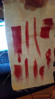
My other form of experimentation was done before adding the color sections in an effort to see if I could directly replicate Morris Louis' method of painting. I took a scrap of untreated canvas and put down some thinned paint, and tried to turn it to move the paint around. However, the paint just soaked right in, and I'm still not quite sure how the method would've ever worked. I think I mistook something. But I gave it a shot! |
Reflection
I'm relatively happy with the end result for this piece. I made very few changes from my original idea for this piece, which I'm glad about. It's a relatively important piece to me, and expresses the most of myself than any other so far. If I could redo this piece, there's a few things I would redo. First off, the figure in the middle panel is really rough looking and I don't like it. It's less obvious with the color streaks now, but it looked kind of gross. I painted it before I did the first panel and thought that it was perfect like that, but once I made the relatively clean first panel figure it bothered me. The other thing I would redo is the color streaks. They're kind of messy, and I'm not sure how I made them so rough in spots, especially when I was trying to make an effort to make it as clean and even as possible. It's frustrating. On the topic of redoing this piece, I did redo the first panel while in the process of painting this piece, which I'm very glad I did. In the original, I projected my planning sketch, but it went against my general goal of representing my own emotion on my own face. It didn't look like me, or any kind of living person. It just didn't work, and I'm glad I started it over.
In "Untitled" by Cindy Sherman, there is an unusual framing of the woman's face, and the image is in black and white to convey a feeling of dramatics, like an old movie. I did a similar thing in my first panel, framing the figure to cut off part of the arm and not showing any definite end to the side of the torso. There is also a use of dramatic facial expressions used in both pieces. In "Where" by Morris Louis, there is sections of color best defined as 'streaks' through the canvas, which are relatively uniform, but incorporate unusual tones of each color used. In my piece, I also used similar streaks, although much thicker and larger. They both create a movement from one part to another, bottom to top in his piece, and right to left in mine.
In "Untitled" by Cindy Sherman, there is an unusual framing of the woman's face, and the image is in black and white to convey a feeling of dramatics, like an old movie. I did a similar thing in my first panel, framing the figure to cut off part of the arm and not showing any definite end to the side of the torso. There is also a use of dramatic facial expressions used in both pieces. In "Where" by Morris Louis, there is sections of color best defined as 'streaks' through the canvas, which are relatively uniform, but incorporate unusual tones of each color used. In my piece, I also used similar streaks, although much thicker and larger. They both create a movement from one part to another, bottom to top in his piece, and right to left in mine.
ACT Responses
1. Clearly explain how you are able to identify the cause-effect relationships between your inspiration and its effect on upon your artwork.
The dramatic feel from the black and white and the light feeling of the colors are both well represented in my piece and inspired by my listed inspirations.
2. What is the overall approach (point of view) the author (from your research) has regarding the topic of your inspiration?
They say that Cindy Sherman always liked experimenting with different identities and feelings. The also wrote that Morris Louis' painting is based around openness and clarity.
3. What kind of generalizations and conclusions have you discovered about people, ideas, cultures, etc while you researched your inspiration?
That a lot of people miss the point of Sherman's Film Stills series, me included.
4. What was the central idea or theme around your inspirational research?
My idea was around two different kinds of emotion: being closed off and anxious, and being open and happy.
5. What kind of inferences (conclusions reached on the basis of evidence and reasoning) did you make while reading your research?
That Louis was a very private person, since no one saw him while he painted his pieces.
Sources
"MoMA Learning." MoMA | Cindy Sherman. Untitled Film Stills. 1977–80. N.p., n.d. Web.
"Where, 1960 - Morris Louis." www.wikiart.org. N.p., n.d. Web.
"Where, 1960 - Morris Louis." www.wikiart.org. N.p., n.d. Web.
