
|
"Presence"
|
Inspiration & Research

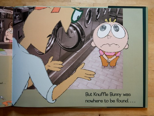
This piece is inspired by Mo Willems and his children's book Knuffle Bunny: A Cautionary Tale, which I read as a young girl. It's a book about the writer's young daughter, which is made with photographs of his neighborhood in Brooklyn, New York where they live and drawings he made over them. These are used as the illustrations of the book, which are all very simple and cartoony. The characters are made up of shapes that are cute and indicative of their age and personality. His lines are all relatively thin and simple, following the idea of keeping his artwork as simple as his stories. Willems came up with the idea of using photographs as a background while working on some illustrations for the book. He was struggling to make the characters pop, and while he worked he knocked one of his drawings down, which landed on top of the photographs on his lightbox. He talks about the benefits of it, stating: "They’re purer than more realistic drawings of the character would have been, because their design focuses on their emotional side."

|
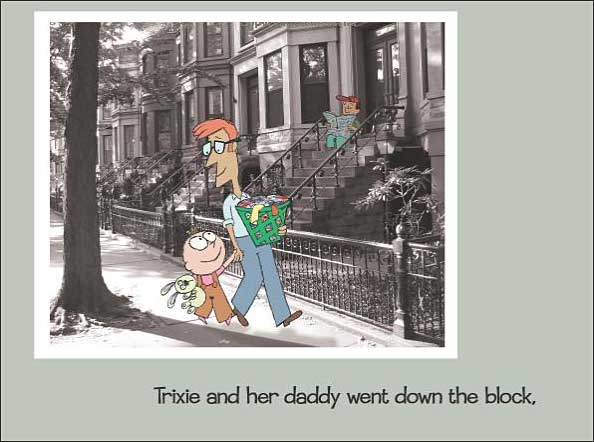
This drawing on the right is from the original manuscript for this book, with a preliminary drawing of the girl's stuffed animal. This is what it looked like before it was scanned and layered into an editing program over the photographs he took of his neighborhood.
|
Planning


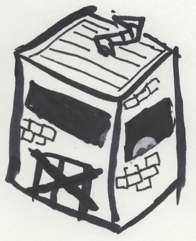

These sketches were made with black marker and white pen, which are indicative of how much contrast I was considering including at first. The first, leftmost sketch was the first I put together for this piece. I had no idea where I wanted to take my images for the project, so I just used a house as a stand-in for any location. Many of these sketches, like this one, drew off of the idea of the ghost contrasting against a dark shadow. The second sketch from the left is similar, in that I had no clue where I wanted to shoot yet, but it includes a few differences. One is that there is a person on the left of the house, which would've made for a very different result. It also includes arms for the ghost, which I felt was too many details for the simple character I was trying to create. I liked the idea of them almost being like kiwis, where they just hop and walk around without any working arm-like appendages, I feel like it makes them cute and unthreatening. The third, middle sketch is closer to what I ended up creating. It has a simple design, and having a background and a foreground became important to the piece as the ghosts begin hiding behind things not just from their perspective, but the viewer and camera's as well. This one has nailed what I wanted them to look like. The fourth sketch is when I started coming up with ideas for locations, placing it in an extremely rudimentary abandoned factory like building. The ghost hiding at the bottom of the window also became important to my piece, not seeing most of the ghost. Last is my fifth sketch, where I decided upon having many little ghost creatures floating around together. This building was a combination of my memory of a closed die-casting business near my house and an abandoned hotel/bar/trailer park which I discuss later. I wanted to have them interact with each other and their environment, which they do in my final piece. However, I felt like their looks were too cutesy, with ridiculously large eyes for their small bodies, as well as highly emotive mouths. There is also a snake in a boot hiding next to this building, which was drawn as an attempt at considering more than one type of creature in the piece, which I ultimately dropped because I felt that the ghost creatures were better off standing on their own.
Process
|
To start for this piece, I took some images with a medium-format black and white film camera, a Holga 120N. These were the same images taken for “Quiet”, where I took two rolls worth of images, and had them developed and photographed. After having these printed, I scanned all of my photographs and balanced them as well as I could to make sure the contrast and brightness were accurate to the real photos. Then I had to decide which image to use for this project. I went through a few ideas, including this image of an abandoned building. This building is special in particular, since it is very close to my home, but was also formerly a “hotel, bar, and mobile home park”, which essentially served as low-income housing for many people in my area. Since it was shut down, the place has become completely abandoned, despite it being an extremely old building with the bricks that named Milwaukee the “Cream City”. I thought this would be perfect to put my creatures into, but the images I took of the building unfortunately came out relatively blurry and grainy, which looks neat on its own, but didn’t contribute well to my piece.
|


|
Pushing through the creative block that my planned background's uselessness caused, I just went ahead and made my little ghost things I designed. I pulled some of the poses from my planning sketches and just came up with others as I worked. I would cut out little squares and rectangles from some sketchbook paper, and then sketch the character. I often had to remember to not make the legs only a line, as I had in the planning sketches, because they would only be paper, only pencil on the eyes. Then I would cut the shape out of the paper, and make a few trims to the shape to make sure it makes sense, shape-wise. Then I flipped it over to the side without the sketch on it, and made a few more adjustments to make sure it looked okay from that side. Then I would add the eyes, typically similar ones to the eyes from the sketch. I made nine of them total, all with different eyes and legs.
|
|


|
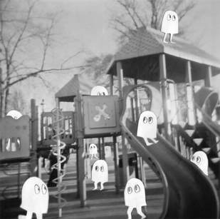
The next step was to scan my ghost creatures. I taped them all to a sheet of blue construction paper to make sure there was sufficient contrast between them to make isolating them easy, and easy to scan and not worry about them scattering when I put the lid of the scanner down. Then, I took the scanned image into Photoshop, and used the quick selection tool to remove the paper background and saved it as a new file with this transparency. Then I looked through my images and decided upon the photo of the playground because it was relatively sharp, yet still grainy and obvious that an older camera was used to take it. It also fit the the idea of imagination in ordinary places, it just stressed the idea of truly ordinary places rather than abandoned places.
|
|
I started by copying the ghost from the transparent sheet, and simply pasting it into the scene. Sometimes I would flip it, or resize it to fit the perspective of the image. In this particular instance, I had to edit the ghost creature to stand behind the slide. In order to do this, I took the layer the ghost was on and made it a bit more transparent, in order to see where the slide was. I then took the lasso tool and traced along the edge of the slide, and then included the entire bottom of the ghost. Then I zoomed in and took the eraser tool to erase a little bit more and make sure it was clean enough. After I did what was necessary with each creature, it was complete.
|
|


Experimentation
|
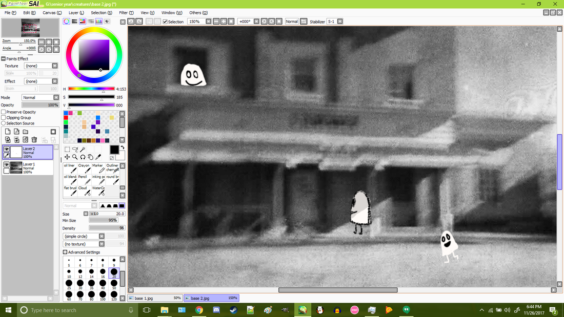
Before deciding that the photo of the abandoned building wasn't going to cut it for this project, I was planning on drawing digitally onto the scanned photo. When I first started, I brought the image into Paint Tool Sai and drew the creatures a variety of ways, all of which I was unhappy with. The doodle look of the one in the bottom right was okay, but I still didn't like it. I tossed around using an outline, or shading them to fit into the scene like the one in the center. The one in the top left is uncomfortable and creepy looking, and this one in particular caused me to drop the idea of giving any of them mouths.
I also considered using a few other images for this project. The left one has this chain link fence in front of of it, with an interesting framing of the playground, but editing the ghosts behind it seemed like it would be terribly tedious and frustrating. I also considered this image of a dock, where the creatures would be splashing around in the water. However, the photo was too distorted for my liking to use for this project. |


Reflection
Overall, I really like the result of this piece. It's by far the cutest thing I've made and it feels wonderful. It was refreshing to work on something that's less heavy than some of my other pieces and focus on the idea of imagination. I used this project to try and use my imagination a bit more too, which is something I feel I've lost over the years. I'm now overly critical of everything I draw and make, so to create something more simple and childish was rewarding. I couldn't bring myself to harshly criticize my little ghost creatures because they're like my little children. However, I feel like this piece would benefit from being a series of sorts. I want to go out and take more pictures of various places around my area, making sure to use a tripod to avoid the overly blurred images like that of the abandoned hotel, and come up with more creatures to put into those scenes. I'd like to find a variety of places, and if I were to start this project over, I would've found some places with more meaning to myself specifically. The playground in the image is in a completely different part of town from where I lived, but limitations on when I could have my photos developed led me to take photos close to the camera shop rather than close to home.
Compare and Contrast
|
My piece is similar to his book in many obvious ways. We both used editing software to put our characters into a photograph, which we both scanned. Both of our background photos are also in black and white. However, his character are people, who are in color and fully illustrated. My ghost creatures are not in color, nor are they full illustrations. They are cut out pieces of paper, with the only drawn on aspects being the eyes. His characters have outlines and all of the basic features to the human face and body. His work is also obviously a picture book, sequential and meant to tell a story. My piece is a single image without any story to it other than the one viewers may extract from it.
|
  |
ACT Responses
1. Clearly explain how you are able to identify the cause-effect relationships between your inspiration and its effect on upon your artwork.
Willem's book inspired me to layer characters over actual photographic images. They are also meant to fit into the scene, the way I made mine.
2. What is the overall approach (point of view) the author (from your research) has regarding the topic of your inspiration?
That his book was visually interesting due to its mixture of illustration and photography. He himself also enjoyed it, since it was different from his other books with drawn backgrounds, or none at all.
3. What kind of generalizations and conclusions have you discovered about people, ideas, cultures, etc while you researched your inspiration?
People love when something relatively unique comes around, and especially when the premise of it is very simple and easy to understand.
4. What was the central idea or theme around your inspirational research?
How Mo Willems came up with the idea for the visual style of his book, and what inspired it.
5. What kind of inferences (conclusions reached on the basis of evidence and reasoning) did you make while reading your research?
That this book is beloved by many, and that children will enjoy it for years to come because of its timeless visual style.
Sources
Bird, Elizabeth. “Top 100 Picture Books #7: Knuffle Bunny, A Cautionary Tale by Mo Willems.” A Fuse 8 Production, 19 June 2012, blogs.slj.com/afuse8production/2012/06/19/top-100-picture-books-7-knuffle-bunny-a-cautionary-tale-by-mo-willems/.
Caryn. “Book Review: Knuffle Bunny By Mo Willems.” Three books a night, www.threebooksanight.com/book-reviews/book-review-knuffle-bunny-by-mo-willems/.
“Knuffle Bunny: A Cautionary Tale by Mo Willems.” Knuffle Bunny by Mo Willems, www.the-best-childrens-books.org/Knuffle-Bunny-A-Cautionary-Tale-lesson.html.
Russo, Maria. “Mo Willems and the Art of the Children's Book.” The New York Times, The New York Times, 17 Mar. 2016, www.nytimes.com/2016/03/18/arts/design/mo-willems-and-the-art-of-the-childrens-book.html.
Willems, Mo. Knuffle Bunny: a cautionary tale. Hyperion Books for Children, 2004.
