    |
Flora (working title)
|
Critical Investigation


For this piece, I had two main inspirations. One was Georgia O'Keeffe's flower paintings, specifically "The White Flower". After O'Keeffe lived in many cities, such as New York and Chicago, she visited and later moved to New Mexico. This change in location changed her inspirations, shifting from urban environments to different elements of the natural world. This included flowers, animals, etc. The choice to fill most of the frame with this flower inspired my framing and composition for two of the images in the series. The idea of going from a normal urban area to somewhere with a bit more of the natural world inspired me to take photos at the gardens I was visiting.
My other inspiration was some of Monet's flower bed paintings, such as "Chrysanthemums" and "Irises In Monet's Garden". The framing of the former especially inspired mine in the other two images, where a focus on nothing but a theoretically infinite amount of flowers. The framing doesn't imply an end to the flowers depicted in the images. The latter was more of an inspiration for the texture found in some of the images. The idea of many, many flowers creating a textured surface is very Monet, and I wanted to go for something like the texture found in his paintings. The project was originally planned to be a study of texture found in nature, with extremely macro images focusing on these things. Monet also painted the start of many of his pieces on location and then reworked them later at his studio, which could be compared to the idea that I took these images, and brought them home to do touch-ups in Photoshop.
Both of these artists and their art inspired the general ideas behind this piece. Georgia O'Keeffe wanted to capture the power and the emotions that can be found in everyday objects, like the numerous flowers she painted. The idea boils down to the beauty of the object in itself, without a need to change it, but emphasize it, such as how she created her relatively large paintings with a bold focus and unusual close-ups. Monet's general goal within the impressionist movement was to capture a moment in time and create an 'impression' of whatever his subject was. In a sense I did this as well, as these flowers will never look this exact way again.
Planning
Part of my goal with this project was that there wasn't much of a plan. I just knew I wanted to take photos of flowers, and whatever I found near them, like the bee in one of my images. In a sense, the planning was sort of the shooting of the images themselves. So I took many pictures of a variety of plants, not just flowers, and whittled down what images I wanted to use from there.

|
This picture of a large magenta hibiscus was one of the images I seriously considered for this project, however, I made that decision while only having seen the preview of the image on my camera. I changed my mind due to the composition being basically nonexistent. It's better as a test image. I also didn't like the extreme brightness of the magenta, it didn't feel nice on my eyes.
|
|
This image was also another consideration for this project. I ultimately decided against it because I wasn't aware of what it was that I was shooting at first. At the gardens I visited for this project, after taking some photos of these beetles on the flowers, I overheard that they were invasive Japanese beetles which were eating the flowers, not a natural part of the ecosystem built there. I felt that the image itself would go against the simple intention behind the project: simply displaying the beauty of a variety of plants, with the color and textures they have, as well as finding the human quality in these flowers. This would create a more complex theme.
|
|
|
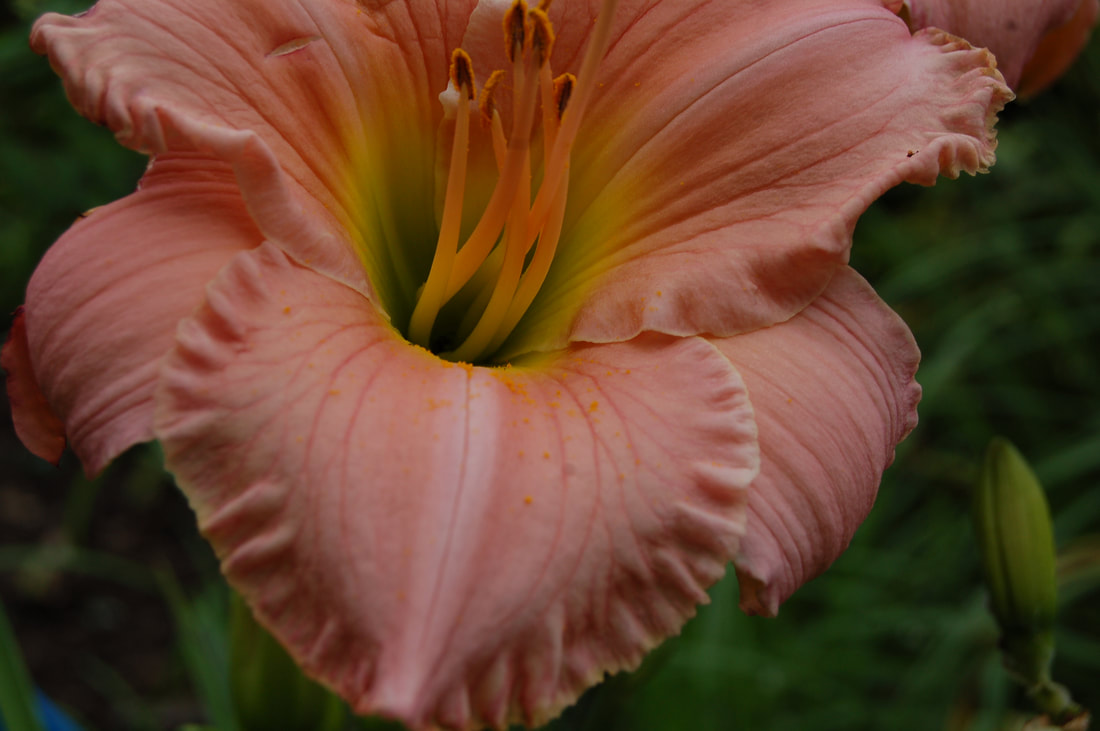
I loved, and still love the composition of the image. However, due to this composition I felt the image had an ominous quality to it. This potentially could've been edited a bit to give it more of the vibrancy I gave the other images, however I felt having more than one lily in the main series might be a bit overboard. I ultimately chose the yellow lily over this one because it had more of a feeling of being a candid photo, if that makes sense. The image I took felt more like a smile.
|
|
Here was another example of too many lilies. I especially didn't want to use this image with the previous one, since their main color is also nearly identical. This image gave me the feeling of a candid photo again though, but I ultimately just thought that the picture itself was kind of boring. Too many lilies.
|

|

|
One more image I seriously considered was this one. This was unfortunately a case of it just not fitting. While I was deciding how to arrange whatever photos I liked, I found that I wanted two pairs photos that were similar to each other in some way. The two yellow flowers I chose were not only yellow, but relatively large flowers, with defined petals that looked in a direction. The other pair focused a bit more on the texture created by smaller flowers, and this blossom certainly has a lot of texture, but the general look of it didn't fit what I was going for.
|
Process


|
I started with the curves, which is the ultimate tool for changing the levels in the image smoothly. This allowed me to bring out the green of the plant behind it and brighten up the lily. Changing the measurement line from a straight line to a slightly curved line allowed me to shift all of the values of the image and keep the balance between them generally the same.
After the curves, I used the hue/saturation modification tool. I didn't touch the hue at all, but I did bring up the saturation of the whole image just a tiny bit to make the flower pop a bit more, and bring out a brighter green. I balanced this out by making the image just a tiny bit darker, preventing it from looking too bright. |


|
For this image, I first opened the vibrance tool. I brought up the vibrance by quite a lot, allowing the purple to pop a lot more to suit the other pictures. After this, I brought up the saturation some to help make the purple more solid, and the green of the plant followed as well, creating a solid medium green.
After that, I used the color balancing option to tweak the general hues of the image. I moved red to cyan, creating a cooler purple to the flowers, and brought the blue to yellow, making the leaves in the background a more yellow green color which has a lot more life to it. Adding the yellow also helped the bee to stand out a bit more. |


|
For this image, I used the curves tool again to create a smooth lightening of the photo. The image was generally a little dark, and maybe should've been shot with a longer shutter speed. So I brought up all the values a bit, mainly the mid-tones through the basic curve. This whitened the flowers and brightened the green of the plan to a less drab hue.
Next, I went into the levels tool, which allowed me to make the colors of the image more interesting. The shadows became darker, the highlights became brighter, and the mid tones became a little darker which gave the image a bit of a fuller quality. The white is bright and clean, yet a bit warm still. The shadows became more noticeable. The yellow pops more and doesn't fade into the image as much now. |


|
This image needed the most work. First was editing using the levels tool. The only change to the image made with this tool was the mid tone setting. The output range was not changed. The mid tones were made brighter to make the general image brighter, as most of the image is mid tones and shadows due to the very dark plant it's a part of in the background.
Next bit of editing I did for this image was using the curve tool. I created an S curve, which makes the light parts lighter and the dark parts darker. It's a slight curve, making the change not be too dramatic. Since the background is mainly dark and the foreground is mainly light, this created a bit of bokeh. It helps draw more attention to the foreground and the vibrant yellow of the flower. Next I used the vibrance setting to make the image slightly fuller. It brought the lighter yellow stripes of the petals out more, making them more vibrant and blending more into the image. To do this, I brought up the vibrance a bit and the saturation only up by +1. Lastly, I used the color balance on the image, and only the yellow to blue slider. I brought it to the left, to yellow, making the image just a bit more brightly yellow, and taking out a bit of coolness to the picture. It also brightened the background just a tiny bit, making the difference between the foreground and background a little less stark. |
|
|
|
Experimentation


For the image of this flower, these are the alternate shots I took that weren't too blurry. They all have a relatively similar angling, but the framing between each of these and the final image isn't. The right-most image is the most obviously different, with no cut off parts of the flower. The left-most image has more of the bottom petals cropped off, whereas my final image has more of the top petals cut off. The image was too top heavy, making it unappealing. The middle image was taken at a slightly different angle, creating a thinner subject that didn't fill up the frame as much as I wanted. I wanted the image to be mainly filled with the subject, making it comparable to a sun or a star. The right-most image also suffered from the same flaw: the image has more background than foreground, losing the quality I was going for.
  |
These two images were taken to see how the general texture of the image would change, depending on the amount of zoom used on the subject. The left image definitely created a different texture, but the actual image itself wasn't terribly interesting. It also has a few stray violet flowers, disrupting the homogeneity I was trying to capture. The right image is much closer than my final image, but the foreground of the image is unclear, and the inconsistent focus made the image look unclear.
|


These three images of this lily are all essentially identical: nearly face-on to the flower, the blossom is in the dead center of the image, the top and bottom center petals are cut off by the end of frame. Of course, they're all slightly different somehow, in ways that I don't have the patience to nitpick. While I was taking these images, I noticed how boring the framing of these were. Then, I decided to change my angle to less of a stock image, which created a whole new look at framing this flower. In a sense, the experimentation was the final image I took of this flower. Changing this angle created a brighter feeling, and almost creates a head, looking up and into the distance behind the viewer.

|
This last image was part of my attempt to create my final, in that I actively tried a new camera angle. I wanted to create the feeling of looking straight down at these plants and this bumble bee, which is almost reminiscent of looking down from a high building at a city below, with the stalks of flowers being other tall buildings. However, it didn't match with my other wider-shot image, in that it didn't create any kind of feeling of an unending flower patch. That idea was very important to me, and the wood chips found in the background of the image destroy that feeling.
|
Reflection
This will be made into pages later
I just don't have a lot of confidence in my ability to make it look nice
Overall, I'm pretty satisfied with the outcome of this project. I wanted to do something I wasn't really able to do prior to this, and photography seemed like a simple start. It puts out what I want it to, and seems relatively effective at it. I made an effort to have a lot of texture, and opposite textures. The images of the many small flowers created a lot of the smaller texture found in Monet's paintings, and the colors are comparable to his. The images of the larger, closer flowers are very smooth and the small bits of texture are visible, in the same sense as Georgia O'Keeffe's paintings of large flowers, with the little details included and whatnot. I made an effort to frame the images similarly to their respective inspirations as well, which I explained prior. I would say that an obvious difference is in the medium. Another obvious one is that their images stand mainly on their own, and not to say mine couldn't be separated, they simply work best together and in the specific arrangement I have them in.
That all said, that doesn't necessarily mean that this piece is perfect. One concern I had while putting this project together was that I might have too much yellow in the final composition. I specifically avoided too much yellow, or there might not be enough variety for the series to be visually interesting. In the end, I feel like there is just enough yellow, but the yellow combined with the white flowers creates too much light color for my liking. The purple, as a contrasting hue, works great with the yellow flowers, but the white feels out of place. However, since I wanted to make sure I had two varieties of texture, this was all I had to work with at the end of the day. Other images of smaller flowers and rough collective texture either didn't turn out or weren't interesting. So instead, I took the weakness among them. If I feel inclined to, I may replace the image in the future.
ACT Responses
1. Clearly explain how you are able to identify the cause-effect relationships between your inspiration and its effect on upon your artwork.
Monet and O'Keeffe had influence on my framing and subjects. They both share the same general concept, capturing the beauty of the natural world, which also influenced mine.
2. What is the overall approach (point of view) the author (from your research) has regarding the topic of your inspiration?
In my sources on O'Keeffe, the author views much of her work as having a focus on formal elements, like line and form. On Monet, there's a general conveyance of respect for him and his importance within the impressionist movement.
3. What kind of generalizations and conclusions have you discovered about people, ideas, cultures, etc while you researched your inspiration?
That the appreciation of nature, flowers, and their natural qualities is widespread, around the world, through time.
4. What was the central idea or theme around your inspirational research?
The idea of a subject being portrayed mostly as is, but also through the lense of someone's own eyes.
5. What kind of inferences (conclusions reached on the basis of evidence and reasoning) did you make while reading your research?
That impressionism was a very important movement within the timeline of art history.
Sources
Meyer, Jeff. Photoshop Curves Tool: 6 techniques every photographer must know. 18 Mar. 2013, www.techradar.com/how-to/photography-video-capture/cameras/photoshop-curves-tool-6-techniques-every-photographer-must-know-1320970/2.
Monet, Claude. “Chrysanthemuns.” Wikiart.org, 1897, Private Collection, www.wikiart.org/en/claude-monet/chrysanthemums-1897.
O'Keeffe, Georgia. “The White Flower.” The White Flower, 1932 by Georgia O'Keeffe, 1932, www.georgiaokeeffe.net/the-white-flower.jsp.
Monet, Claude. “Irises In Monet's Garden.” Irises In Monet's Garden - WikiArt.Org, 1900, www.wikiart.org/en/claude-monet/irises-in-monet-s-garden-03.
Georgia O'Keeffe Biography, Art, and Analysis of Works. N.p., n.d., http://www.theartstory.org/artist-okeeffe-georgia.htm.
Auricchio, Laura. Claude Monet (1840–1926) | Essay | Heilbrunn Timeline of Art History | The Metropolitan Museum of Art. www.metmuseum.org/toah/hd/cmon/hd_cmon.htm.
